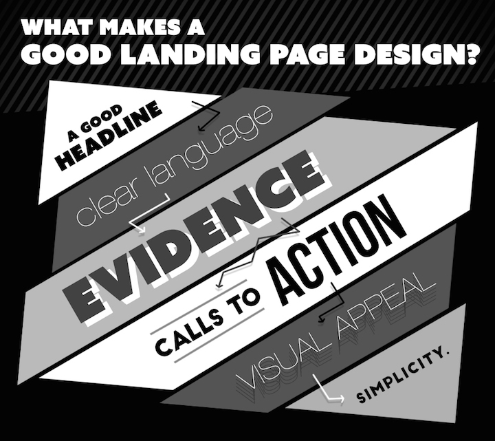
Since a landing page is the first thing a visitor to your site will see, you want to make sure that it sends the right message. The landing page is not by definition the home page, but the page an ad will lead visitors to. It’s intended to raise their interest and encourage them to click through to other pages. This means that landing pages should send a direct message and provide specific opportunities for viewers to engage further. Here are six sure-fire ways to develop landing pages that succeed in upping interest and engagement.
- Headline: You can turn browsing into reading with the right headline. Headlines work best when they are catchy, relevant, and concise. Try to think of what excites you, and then figure out a clever way to convey that excitement over to a targeted audience.
- Clear Language: The overall goal of each sentence on your site should be to get people to read the next sentence. This can be done by using active language, engaging examples, and language that provides your reader with clear information.
- Provide Proof: Most likely, your landing page is making a claim of some sort. In order to do this well, you have to provide your reader with some proof. So take some time to determine what you are promising or providing, why you are the best choice for the service, and a specific example that will show your reader why they need you or what you are offering. When developing this proof for your readers it’s essential to make sure you’re language remains clear and concise.
- Calls to Action: Readers respond well to simple instructions for calls to action. Make it easier on them by telling them clearly what their next step should be. And make sure you are only asking for one thing on your landing page. You don’t want to confuse or overwhelm your readers.
- Consider Visual Appeal: Aesthetics are important. A visually appealing landing page will be more successful than one that is difficult to process or boring to look at. Experiment with different fonts, colors, and visual elements that are targeted towards your ideal market range.
- Keep it Simple: Think streamlined, engaging, and easy to follow. You want someone who visits your landing page to be able to find out all they need from it. Consider including graphics, information charts, and quick registration fields. You have a matter of seconds to grab and maintain viewers’ attention, so it’s important that this page is easy to glance through.
Before putting in the time on design, start by mapping out what your goals are. What are you offering and what do you want viewer’s reactions to be? Answering these two questions is one of the easiest ways to ensure that your landing page lives up to expectations and produces the desired results.


