Even though the internet has swept the marketing world into a digital storm, print materials are still very relevant. Business cards, posters, sell sheets, folders, tri-fold brochures, and the like continue to remain vital through technological advances like the introduction of tablets and smartphone apps. Print is still a part of the marketing landscape you need to tap into.
Printed materials are especially handy when internet connectivity fails. For example, tourists and traveling professionals visiting from out of state may experience spotty connections, because they are in areas that their mobile service provider does not cover well. In those times, they will wish they had something they could hold in their hands. In addition, there are still clients that do not completely live and breathe the world of the internet yet. Branding print materials to match your company’s website and its various social media outlets are still pertinent.
The fundamentals of design apply whether you own your own two-person business or work for a firm that rakes in hundreds of millions of dollars in annual profits. Whether it’s large or small, high-quality marketing materials make your company look like it is leading the local or even national competition. If your marketing material looks professional, your prospective clients will definitely take notice.
Your goal should be to grab the attention of the viewer while branding print materials, but you also want them to identify your company. Everything they see from you should be clear that it’s from your company! Establish brand guidelines for your company’s logo, fonts, and color use so employees are in the loop. Here are ways to transfer your online look to develop cohesive print materials:
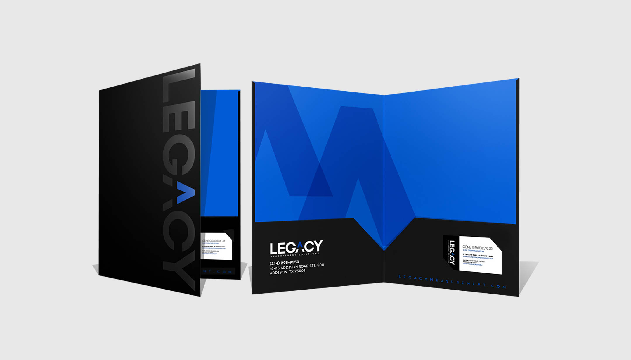
Logo
Your logo is an essential tool for branding print materials. It should appear on your business cards, brochures, billboards, letterhead, website, social media profiles, etc. This is the mark that identifies your company and reminds the viewer who you are. The following elements will help tie the rest of your design style together.
Typography
Use one to three fonts per piece. There should be a primary font and one or two secondary fonts used across your online and printed materials. Choose fonts that aren’t too difficult to read or your company will look amateurish.
Color
Colors convey emotional undertones. McDonald’s and a variety of restaurants know color combinations like yellow and red can make you hungry, and even inspire feelings of happiness and energy. People are drawn to visuals, so color can capture their attention. How do you match colors across different mediums? Here’s an example from Art Director Jim Battista from his article, “Maintaining a Cohesive Brand Identity in Print and Digital“.
“The Pantone Matching System (PMS) code for AT&T’s Blue is PMS 2925 C, which is ideal for print, however you will need hexadecimal (HEX) #3aa5dc to produce a close match of that color on the web. You will need to use red, green and blue (RGB) R58/G165/B220 for broadcast. This is where your brand guidelines will help you and your designers maintain a cohesive brand identity across all mediums.”
Just like a business plan is essential, it’s also essential to establish brand guidelines for your company’s online and print marketing. Your company’s image is key, because it will convey certain things that will attract prospective clients. Grab their attention and make your company recognizable with professional, cohesive branding.