You have somewhere in the ballpark of eight to ten seconds to hook a consumer who is visiting your website for the first time. If you are unable to gain and hold their interest in that amount of time, they will leave. You’ve likely heard this before, spouted by web design consultants like it’s the new gospel, and they’re not at all wrong. However, this statement can often be misinterpreted or misunderstood, leading to a slew of common mistakes in web design. Companies latch onto the idea of being eye-catching or as bombastic as possible, and often end up creating something less user friendly, and more an eye-gouging train wreck. Let’s take some time to go over a few of the most common mistakes often made by companies today. In doing so we hope to lead you into a brighter online future.
Too Much Of A Good Thing
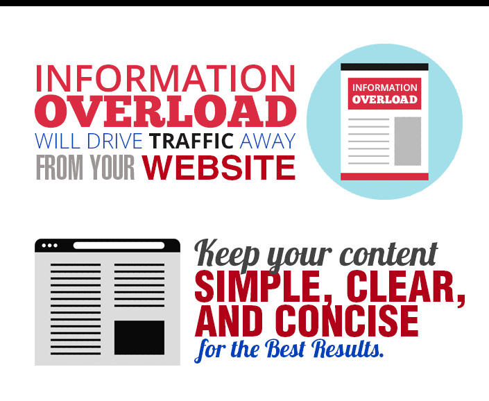
Creating a massive, sprawling site rife with information for any occasion seems like a fine idea on paper, but more often than not it leads to a site that is congested and confusing. A consumer doesn’t have the time to wade through a landing page with fifty plus links and text as thick as a thesis. Consumers want quick, concise information aimed at answering their questions so they can conduct their business and get on with their lives. Every extra click a potential customer has to take increases the chance they’ll run off to another less frustrating site. Keep it simple for the best results.
All The Pretty Colors
Web design that focuses on cramming your site with a million color-coded text blurbs, bright blinking banners, and excessive use of GIF images is a super common mistake. This kind of design is a perfect example of that eye-catching bit of advice gone horribly wrong. To a consumer, eye-catching more often means smart, clean design that emphasizes easy navigation, not a trip through a funhouse.
One of the most awful examples of cramming comes in the form of popup videos. Nine times out of ten, if a new customer comes to your site and is greeted with a four minute long video, they’re going to leave your site well before the video is over. Obligatory videos keep consumers from the meat of your site for too long, and give too much opportunity for them to lose interest. It’s a big no no.
Search Where?
Check out the websites that are top rated for design, and you’re likely to find a very common thread. The search bar is in a spot that is easy to locate. Consumers almost always come to your site looking for something specific, and a search bar provides them the easiest means of finding exactly what they want.
You’re Not Listening
Consumer feedback might as well be the lifeblood of your online business experience. Paid ads and click-through content are fine and dandy, but nothing will keep your site in the green better than positive feedback. Sites that lack some meaningful way for customers to interact with your business on a personal level are strangling themselves.
Too Long, Didn’t Read
To sum up, keep your design clean and simple, listen to your consumers, and keep that search bar in plain sight! Keep these tips in mind and your business will be in good shape to grow.

Download Our Free Guide
What’s your next step? Now that you understand some of the common mistakes, make sure you incorporate these 22 Must-Haves into your website!